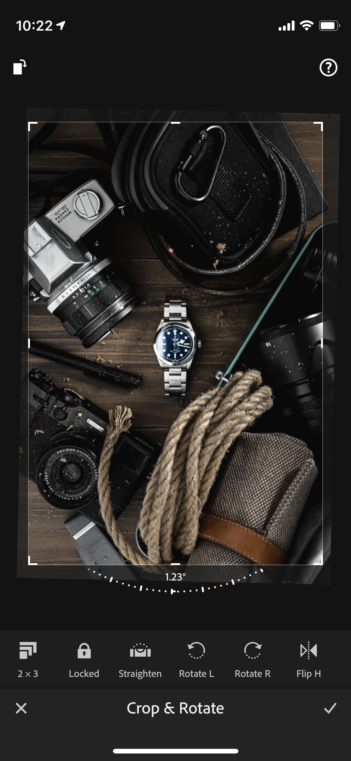
Framing is one of the most critical tools in a photographer's arsenal. A well-framed shot guides the viewer with a clear narrative. The focus is apparent and the surrounding details are complementary. A poorly framed shot, on the other hand, is disorienting, fragmented, and filled with visual tension.
As a photographer, you have two chances to frame a shot right. The first – the most ideal – is in-camera. The second – often the saving grace for in-the-moment errors – is in post production using the crop tool.
Admittedly, a tutorial on cropping sounds pretty boring. But I assure you that the 4 lessons I share from my own poorly cropped photos will make you think twice the next time you're about to hit that export button. Enjoy!
4 lessons I've learned from cropping watch shots (badly)
1. Centering the watch

This is the most common mistake I make and that I see others make: always centering the watch dial in the shot. In principle, it makes sense, but in practice, there are other considerations.

Your eyes see the watch as a single unit. So if the bracelet isn’t perfectly even on both ends, your focal point becomes optically off-centered. It may not always be apparent why, but something will feel off.

If you’re going to center the watch, consider the watch as a whole, not just the dial. This doesn’t mean you always have to center tip-to-tip, but you do need to factor in the visual weight of the bracelet/strap.

Ah, much better. This is how I wish I cropped this shot before posting. It’s a subtle change, but removes the visual tension of a slightly off centered focal point.
2. Balancing the weight

Framing is also about balancing the visual elements in a shot. Now, the root of the issue here is poor staging, so ideally I would just reshoot. But let’s see if cropping can help.

Bright elements generally hold more visual weight than dark ones. And as you can see here, the way this shot is framed puts more of the weight on the top half of the shot.

In this case, centering the dial actually sort of helps shift the weight down, except that the way the bottom strap gets cut off is awkward.

Without a reshoot, I think the best way to save this shot is to crop it in more. This would center the dial, balance the visual weight, and cut off both ends of the strap equally.
3. Not cropping enough

Sometimes staging is so fun that it can get out of hand. I loved playing with the props in this shot so much that I didn’t even think to crop any of them out in the final shot.

As a result, all the secondary elements have equal or greater weight than the focal point (the watch). It’s still a good shot, but the brain and eyes have to work harder to process it.

If I were to re-approach this shot, I would crop it in a lot more to bring focus to the watch. Notice that I’ve centered the watch as a whole too, rather than just its dial.

This new crop feels way better to me. It keeps the focus where it should be without losing too much of the detailing from the surrounding props.
4. Over-cropping

As you’d expect, there’s a counter example to the last lesson. Here’s a shot that is close-cropped. I actually cropped it like this to help balance out my grid. Turns out, what might’ve been good for the grid was bad for the shot!

And here’s why. The focal point takes up most of the frame. While that can be ok, in this case, the focal point isn’t that interesting. What’s more, there’s nothing that interesting surrounding it (because it’s all cropped out!).

But if I were to expand the crop a bit more, I could give the surrounding props a chance to shine a bit more. The shot is instantly made more interesting as a result.

Voila, this is how I wish I cropped this shot. It’s visually more interesting *and* it still would have satisfied my grid. Hindsight is 20/20, as they say.
Closing notes
Be intentional about everything in (and out of) the frame. If it’s not contributing to the story you’re telling, it’s probably taking away from it.
Great photos take a lot of work but should be simple to the viewer. Next time you’re cropping a shot, consider how to bring focus to it and how to minimize distractions!
Your turn!
Let’s see those beautifully cropped shots, friends! Be sure to tag #watchstudies on your results!
1 comment
Hello Verne, just rereading Cropping… Have been fighting with props over powering a few shots… thought a reread might help. 👍🏽